
Building a More Inclusive Startup: Introducing the Diversity Dashboard


Former Director of People @ Buffer
“What gets measured, gets managed.”
This well-known quote is often applied to business situations like marketing or product creation.
But the basic truth is applicable to almost any situation: When we really want to focus on something, we pay close attention. We want details that can help us make good decisions.
And at Buffer, we want the details that can help us grow as an inclusive and diverse team. We want to be conscious of how we grow: With a focus on the values that guide us, and with an awareness that a diverse team across a variety of perspectives not only helps us represent our audience better but also makes us more innovative.
We’re not where we want to be yet in regards to a truly diverse team, but we’ve taken some small steps in this direction, including:
- Modifying our language in job descriptions
- Exploring our own biases
- Reaching out to groups and individuals working on diversity initiatives
- Formalizing a family leave policy and sharing more about how Buffer supports families of all types
As we’ve shared these changes and efforts, one of the major comments we’ve heard in response has been: “Great! So what kind of difference has all of this made?”
Good question!

What gets measured, gets managed.
We’re grateful for the companies and individuals who’ve created frameworks to share, measure and understand tech and startup diversity data, including initiatives like Tracy Chou’s Women in Software Engineering Stats and DoubleUnion’s Open Diversity Data project.
We hope to add our own small contribution to this big effort with the Buffer diversity dashboard.
How the dashboard works
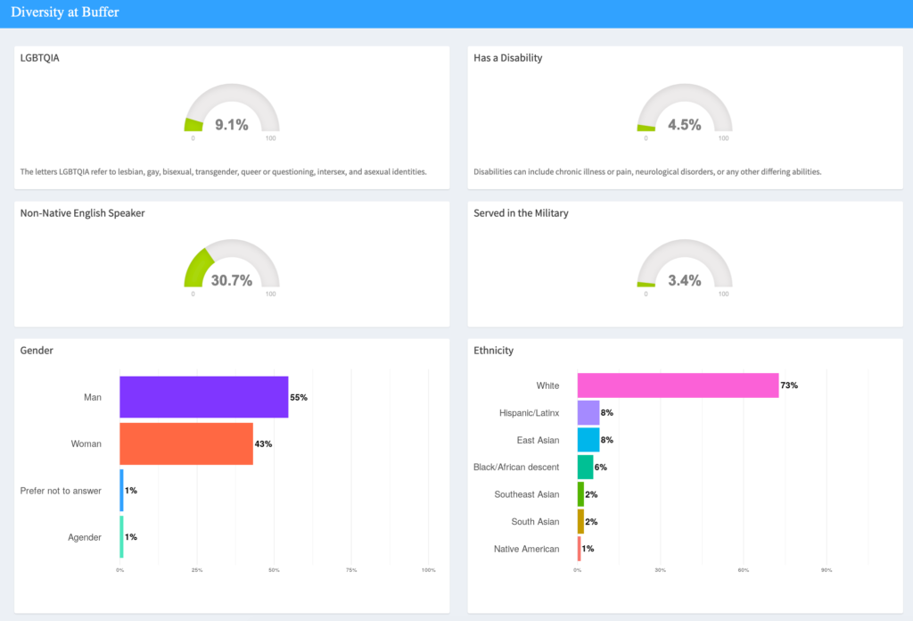
With this dashboard, we’re sharing real-time data on the demographic diversity of the Buffer team, as well as those who’ve expressed interest in joining our team, in the specific areas of:
- Age
- Gender
- Ethnicity
- English as a second language
- LGBTQIA+ status
- Veteran status
- Family status
- Disability status
- Location
You can explore this self-reported data in a few different ways – view the makeup of the full Buffer team, or isolate by just technical roles (engineering, product, and data), just non-technical roles, and just executive leadership roles.
All Buffer team members are invited (but not required) to take a survey in order to collect this data.
We give all job candidates a similar survey. Again, they are invited (though not required) to share with us after their application is submitted.
What comes next
Sharing the dashboard is the very beginning of what we hope to do with this data.
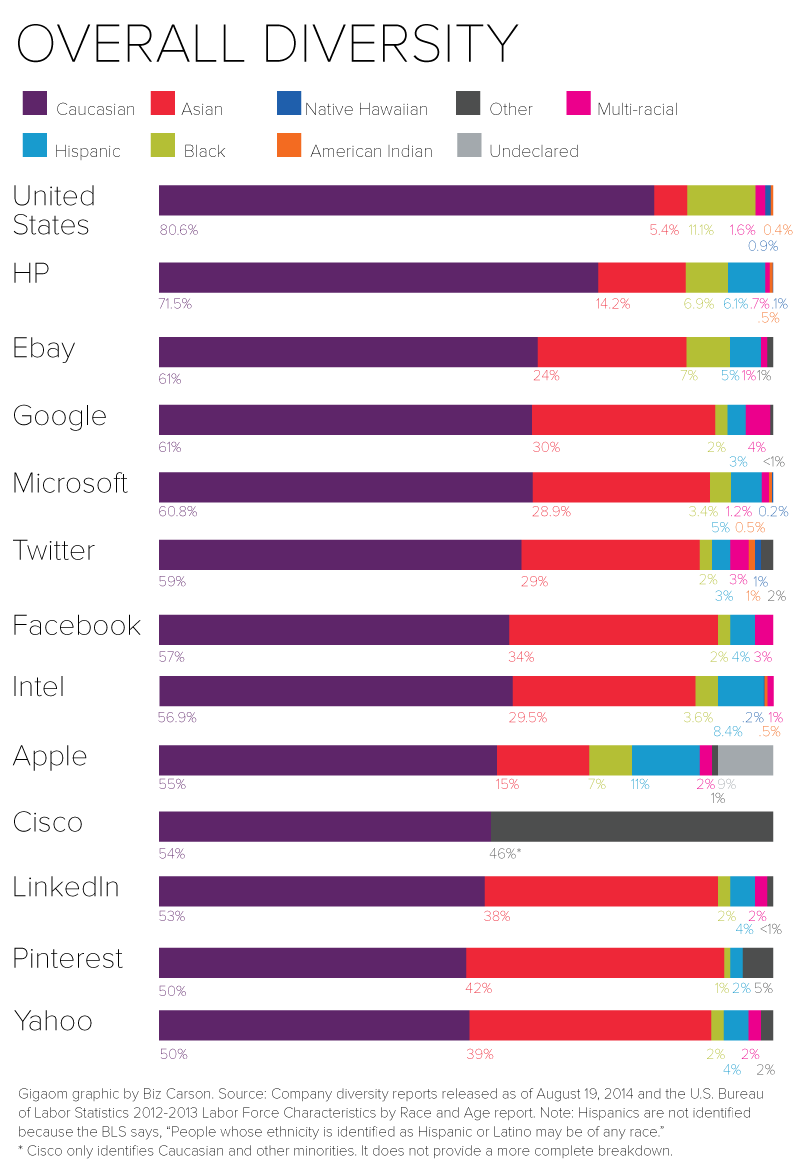
We want to make the data more interactive so it’s easier to interpret and understand change over time. We’d love to add graphs representing the demographic makeup of the workforce of the United States, and even the world in order to see how our team makeup compares to these benchmarks, kind of like this graph from GigaOm:
And we want to add new areas of study over time, because we know that right now we’re capturing only a small part of true, intersectional diversity.
But the main thing we want to do with this dashboard is use it to better understand how we can grow as a diverse and inclusive startup.
Right now, we don’t have a team makeup that feels representative of our community, and this dashboard could be key to figuring out why that is and making changes. Are our job opportunities reaching all kinds of people and communities, including underrepresented groups? Could we change the way we hire to eliminate more bias and create more inclusivity?
We hope the dashboard will be a way to benchmark all our future efforts and discover what, if any, changes we make will have an effect on these numbers. What gets measured, gets managed.
We want your thoughts
Making Buffer more inclusive is an ongoing effort, and members of the Buffer community have been amazingly kind to share their thoughts with us.
Try Buffer for free
140,000+ small businesses like yours use Buffer to build their brand on social media every month
Get started nowRelated Articles
TikTok's parent company must divest the app or face a ban in the U.S. Here's everything we know, plus how to plan ahead.

How the Buffer Customer Advocacy Team set up their book club, plus their key takeaways from their first read: Unreasonable Hospitality by Will Guidara.

In this article, the Buffer Content team shares exactly how and where we use AI in our work.